There is a version of “professional” that has become so widespread it is almost indistinguishable from invisible. Clean white backgrounds. Neutral sans-serif fonts. Stock photography of people looking purposefully at laptops. Copy that describes services in the most accurate and least interesting terms possible.
It is not bad. It is just forgettable. And forgettable is a problem, because the businesses that get remembered, talked about, and recommended are the ones that feel like something.
Personality in web design is not about being quirky for its own sake, or shoehorning jokes into your about page, or choosing a neon colour palette because someone told you it would stand out. It is about making deliberate choices that reflect who you actually are and attract the people you actually want to work with. Here is how to think about it.
Personality starts before the design
The most common mistake businesses make when they want a more characterful website is jumping straight to visual choices: a different typeface, a bolder colour, an unusual layout. These things matter, but they are the expression of personality, not its source.
Before you can design a website with personality, you need to know what that personality actually is. Not in vague terms like “approachable” or “premium” (every business says both), but specifically. What does your business believe that others in your field do not? What is your particular way of working? What would a client say about you that they would not say about your competitors? The answers to these questions are the raw material. The design is just how you communicate them.
Tone of voice is doing more work than you think
Most people focus on the visual side of web personality and treat the copy as an afterthought. This is the wrong order. The words on your website shape how it feels more fundamentally than the colours or the layout, because language carries nuance that visuals cannot.
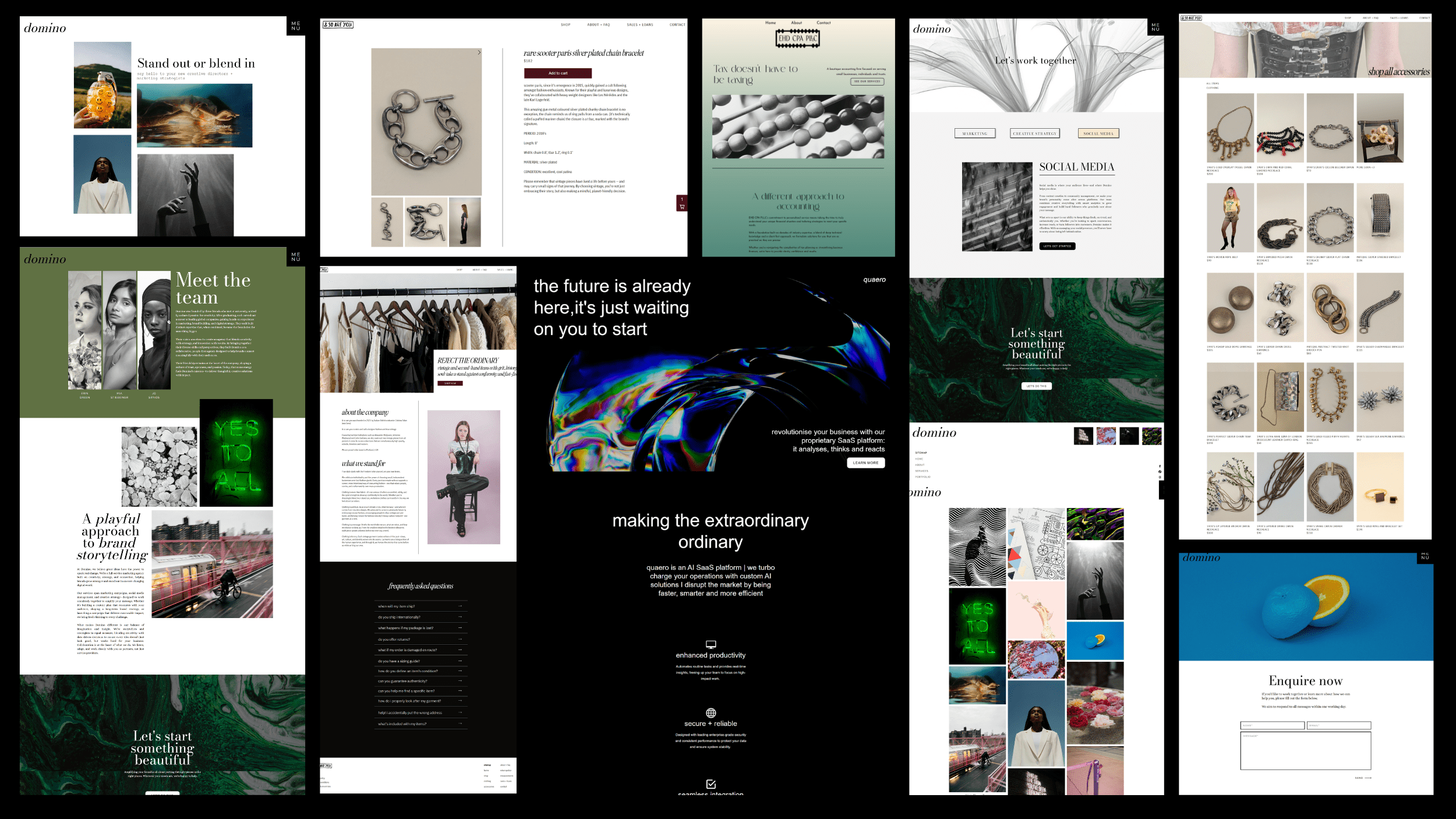
Consider the difference between “we offer strategic brand consultancy services” and “we help businesses figure out what they stand for and make it impossible to ignore.” Both describe broadly the same thing. One sounds like a corporate brochure; the other sounds like a person. Personality in copy is not about being casual or throwing in exclamation marks. It is about writing like a human being who has thought carefully about what they want to say and has the confidence to say it in their own voice.
Visual choices that communicate character
Once you are clear on who you are and how you sound, the visual choices become much easier, because you are making them in service of something rather than in a vacuum.
Typography is one of the most powerful personality tools available and one of the most underused. Font choices communicate tone before a single word has been read: a high-contrast serif says something completely different to a rounded geometric sans-serif, which says something completely different to a condensed grotesque. Most businesses choose fonts that are merely inoffensive. The ones that are remembered choose fonts that are intentional.
Colour, similarly, is not just decoration. It sets the emotional register of the whole page. Warm, earthy tones suggest a different kind of business to cool, minimal neutrals, which suggest a different kind again to saturated, energetic brights. None of these is inherently better. The question is whether the choice is honest: does it reflect the real experience of working with you, or does it reflect the business you aspire to be?
Photography and illustration choices are perhaps the most direct expression of personality on a website. Real photographs of real people, places, and work are almost always more characterful than stock imagery, because they are specific. Specificity is the enemy of generic, and generic is the enemy of memorable.
The difference between personality and inconsistency
One caveat worth raising: personality should be consistent, not chaotic. A website that has a bold, irreverent homepage and a stiff, formal services page is not a website with personality; it is a website with a split personality. The experience of moving through your site should feel coherent.
This does not mean every page has to look the same. It means the underlying character should remain constant even as the content changes. The same voice in the homepage headline and the footer copy. The same visual logic on the portfolio page and the contact page. Personality is not a feature you switch on for the fun sections. It is the thread that runs through everything.
A filter for your perfect client
Being specific, being opinionated, having a point of view: these things will not appeal to everyone. A website with genuine personality will, by definition, attract some people more strongly than others. That is not a bug. That is the whole point.
The businesses that try to appeal to everyone end up appealing to no one in particular. The ones that are clear about who they are and who they are for attract clients who are a genuinely good fit, who value the work, and who tell others about it. A little personality is not a risk to your professionalism. It is an investment in finding the right people.
Want to bring more character to your brand and website? Get in touch and let’s talk about what makes your business worth remembering.
Leave a Reply Cancel reply
@ 2025 copyrighted | eleven eleven studio is a trading name of eleven eleven creative ltd
@ 2026 copyrighted | eleven eleven studio is a trading name of eleven eleven creative ltd
home
our work
journal
contact
services
terms + conditions
privacy policy
home
our work
journal
contact
services
hello@elevenelevenstud.io
