The homepage is the most visited page on most websites and, arguably, the most misunderstood. Ask ten business owners what their homepage should do and you will get ten different answers. Build the brand. Tell the story. Showcase the work. Rank on Google. Impress investors.
All of those things can be true. But they are secondary to one more fundamental job: making the right person feel, within a few seconds of arriving, that they are in the right place.
Everything else flows from that. Here is how to think about it.
Start with who it is for
Before you think about layout, copy, imagery, or colour, you need to be clear about who your homepage is speaking to. Not in the abstract, but specifically: what does this person want, what do they already know, and what question are they arriving with?
A homepage that tries to speak to everyone tends to resonate with no one. This does not mean you cannot serve multiple audiences; it means you need to lead with the one that matters most, or find a framing that speaks to a shared underlying need. If you are a web designer working with both product businesses and service businesses, for example, the shared need is probably something like: a website that makes us look credible and converts visitors into customers. Lead with that.
The anatomy of a homepage that works
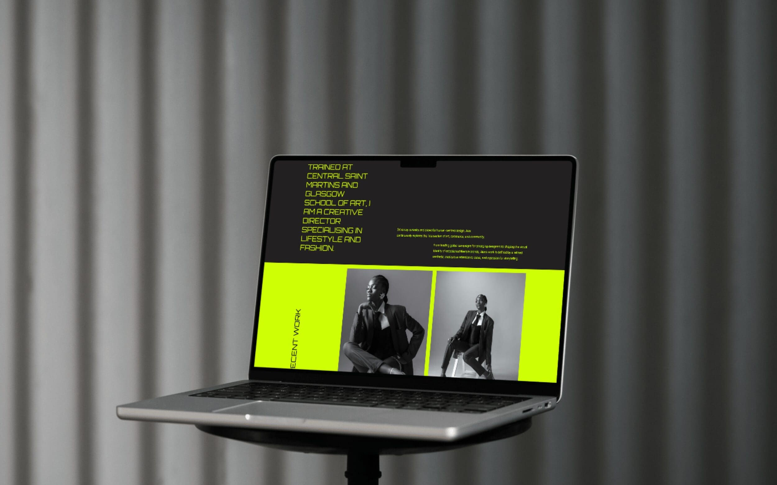
There is no single correct homepage layout, but most effective ones share a similar logic: they move the visitor from attention to interest to action in a way that feels natural rather than forced. Here is what that tends to look like in practice.
The hero section
The hero section is the first thing a visitor sees before they scroll. It needs to do three things, ideally in one or two sentences: say what you do, say who it is for, and give a reason to keep reading.
This is not the place for a mission statement or a brand manifesto. It is the place for clarity. A headline like “website design for independent retailers” tells you everything you need to know in five words. A headline like “we craft digital experiences that elevate your brand” tells you almost nothing. If your current hero headline could belong to any business in your industry, it needs rethinking.
Social proof, early
People are more likely to trust a business that other people already trust. This sounds obvious but it has a practical implication: your homepage should include some form of social proof above the fold, or close to it. Not buried at the bottom after three sections of copy.
This does not need to be a full testimonial carousel. A single well-chosen quote, a row of client logos, a press mention, or even a brief “as seen in” line can do the job. The goal is to establish credibility before the visitor has formed a reason to doubt.
A clear path forward
Every homepage needs at least one clear call to action: a specific thing you want the visitor to do next. The mistake most homepages make is either having too many (book a call, view the portfolio, read the blog, sign up to the newsletter) or having one that is so vague it offers no real direction.
Your primary call to action should reflect your main business goal. If you want enquiries, make it easy to get in touch. If you want people to see your work, direct them to the portfolio. If you are building an email list, give them a reason to sign up. One clear path converts better than five vague ones, every time.
Supporting content that builds the case
Below the hero, the homepage has room to expand: an overview of your services, a sample of your work, a little more about who you are and how you work. This section is where people go when the hero has piqued their interest and they want to know more.
Keep it focused. Each element should serve a purpose: either building credibility, addressing a likely objection, or moving the visitor towards the action you want them to take. A homepage is not a portfolio; it is a curated argument. Show enough to persuade, and leave the rest for the pages that follow.
One more thing: what your homepage is not
Your homepage is not a dumping ground for everything about your business. It is not an index page listing every service you offer. It is not a blog feed or a social media stream. And it is emphatically not the place to auto-play a video with the sound on.
Think of it as a shop window. The window is curated to attract the right people inside, not to display every product in the stock room. What you choose to put in it, and what you choose to leave out, says a great deal about how well you understand your own business.
If your homepage is not performing as well as you would like, sometimes a fresh pair of eyes is all it takes. Book a free website audit and we will take a look at what is working and what could be sharper.
Leave a Reply Cancel reply
@ 2025 copyrighted | eleven eleven studio is a trading name of eleven eleven creative ltd
@ 2026 copyrighted | eleven eleven studio is a trading name of eleven eleven creative ltd
home
our work
journal
contact
services
terms + conditions
privacy policy
home
our work
journal
contact
services
hello@elevenelevenstud.io
