Minimalism is one of those design principles that looks effortless when it is done well and catastrophically dull when it is not. Strip away enough and you are left with something elegant. Strip away too much, without understanding what you are doing and why, and you are left with a blank page that happens to have a logo on it.
The problem is that minimalism is often misunderstood as an aesthetic rather than a discipline. People see a beautifully spare website, all white space and restrained typography, and conclude that the secret is simply to remove things. Take out the colours, simplify the layout, reduce the copy. What they miss is that the websites they are admiring are not interesting despite their restraint; they are interesting because of how carefully that restraint has been applied.
So what actually makes minimal design compelling rather than empty? Here is how we think about it.
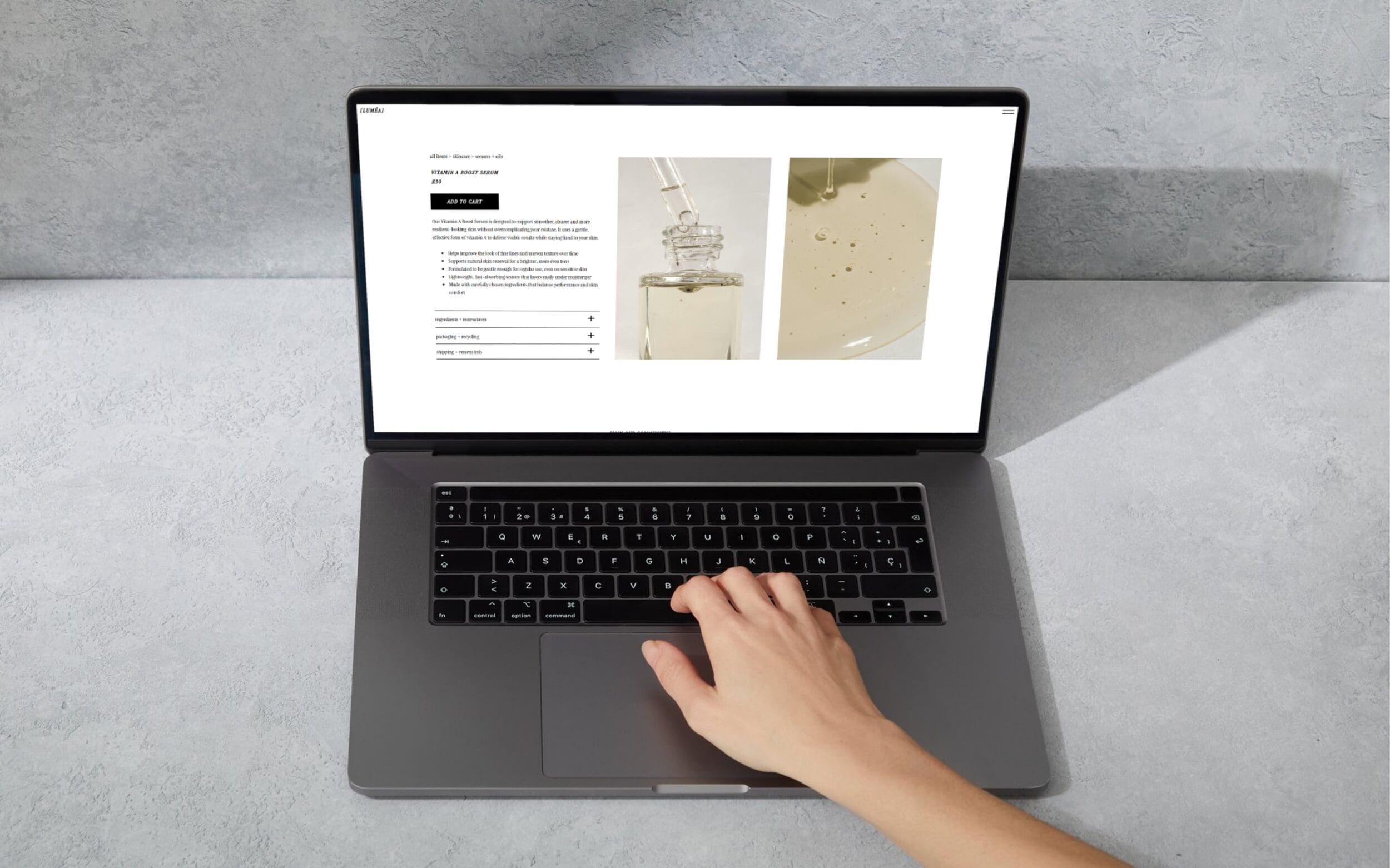
White space is doing real work
The most common mistake in minimal design is treating white space as absence, as nothing, as the bits between the real content. In good minimal design, white space is an active ingredient. It creates breathing room, directs the eye, establishes hierarchy, and gives individual elements the space to be noticed.
Think about the difference between a sentence printed on a full page and the same sentence printed on a billboard. The scale of the surrounding space changes how the words feel, how much weight they carry, how long you spend with them. White space on a webpage works the same way. Generous space around a headline makes it feel considered and confident. Cramped space makes even good design feel anxious. The amount of space you leave is as much a design decision as anything you put on the page.
Typography carries more weight in a minimal context
When you remove visual complexity, whatever remains has to work harder. In minimal design, typography is almost always doing most of the heavy lifting; it is often the primary source of visual interest, personality, and hierarchy on the page.
This means that font choices in minimal design are consequential in a way they might not be on a busier page, where other visual elements share the load. A beautifully chosen typeface with strong character, good rhythm, and considered sizing can make a minimal layout feel rich and deliberate. A generic font in the same layout makes it feel unfinished.
Scale and contrast matter too. Minimal design often uses dramatic differences in type size to create visual tension without adding visual noise: a very large headline alongside small body text, for example, or a single word set at display scale against a large expanse of white. This is one of the ways good minimal design stays interesting without introducing complexity. It uses what it has more ambitiously.
Restraint in colour makes every choice count
A restricted colour palette is a hallmark of minimal design, but restriction does not have to mean colourlessness. Some of the most compelling minimal work uses one strong colour, deployed sparingly, to create moments of emphasis that would be diluted on a busier page.
The key word is sparingly. When you use one colour and you use it rarely, it carries genuine visual weight: it says this matters, and the viewer believes it, because everything else has been neutral. Use the same colour everywhere and it becomes background noise. The restraint is what gives the colour its power.
Neutral palettes, used well, are not bland. Warm off-whites, rich creams, deep charcoals, and carefully chosen greys all have distinct personalities; the difference between them is significant and worth paying attention to. The idea that a neutral palette is automatically safe or boring reflects a lack of engagement with how those colours actually behave, not a truth about minimalism.
Details become the design
On a complex page, small details are absorbed into the whole and rarely noticed individually. On a minimal page, they are everything. The weight of a hairline rule, the exact radius of a corner, the specific leading on a block of text, the way a button behaves when you hover over it: these details are not finishing touches in minimal design. They are the design.
This is part of what makes truly good minimal work difficult and expensive to produce, and why it so often gets done badly when budgets are tight. Cutting corners on a complex design is forgivable; the eye has plenty of other things to rest on. Cutting corners on a minimal design is immediately obvious, because there is nothing to distract from what is missing.
The corollary is that when those details are right, they elevate everything. A well-designed minimal website feels premium precisely because the care taken over small things implies care taken over everything else. The detail is the signal.
Purposeful moments of surprise
The most interesting minimal design often includes one element that deviates from the surrounding restraint, not enough to break the aesthetic, but enough to create a moment of unexpected delight. An illustration that appears on hover. A single sentence set in a completely different typeface. A subtle animation that plays when you scroll past a certain point.
These moments work because they are set up by everything around them. The restraint creates the expectation; the deviation rewards it. Without the minimal context, the same element would go unnoticed. Within it, it feels like a small discovery, and small discoveries keep people engaged in a way that relentless visual stimulation does not. Interesting and complex are not the same thing.
The discipline behind the simplicity
The hardest part of minimal design is not removing things. Most designers can remove things. The hard part is knowing what to keep, and having the conviction to keep only that, even when clients ask whether it looks a bit bare, or wonder whether something should be added to fill the space.
The answer, almost always, is no. The space is not empty; it is working. The restraint is not a lack of ideas; it is a specific idea, held to with discipline. The simplicity is not the starting point; it is the result of a long process of reduction that stops at exactly the right moment.
That moment is different for every project. Finding it is what good minimal design actually is.
If you are drawn to minimal design for your brand or website and want to explore what it could look like, book a free consultation and let’s talk through it.
Leave a Reply Cancel reply
@ 2025 copyrighted | eleven eleven studio is a trading name of eleven eleven creative ltd
@ 2026 copyrighted | eleven eleven studio is a trading name of eleven eleven creative ltd
home
our work
journal
contact
services
terms + conditions
privacy policy
home
our work
journal
contact
services
hello@elevenelevenstud.io
